ICETRO
The best ice machines in the world.
ICETRO

- ICETRO
- CI
CI 
BRAND CONCEPT
- Maestros Delivers Fresh Happiness!
The mind that maestros pursue is technology that will be loved by many, and the goal of such technology is people’s happiness. ICETRO’s brand identity symbolizes the company’s technological capabilities and its credibility as the leader of refrigeration technology in Korea. We hope to become an innovative company that is dedicated to creating new and leading technology. We will realize our goal of creating eco-friendly products one step ahead of our competitors, as well as establishing a safe and pleasant environment, by communicating with our customers. 
BRAND NAME
- ICE+MAESTRO = Fresh Happiness delivered by the masters of ice!
With the refrigeration technology and know-how it has accumulated over the last 30 years, ICETRO has positioned itself as a leading company in the frozen food equipment industry in Korea. MAESTRO means a director of an orchestra or a master or a virtuoso who creates beautiful harmony between music and the audience. The business philosophy of ICETRO is to deliver the pride of a maestro and the spirit of a master, who value tradition and reputation, to its customers. 
SYMBOL MARK
- We have designed an ice house, igloo, and a polar bear. The igloo reminds us of ice, which is a small component of our company’s products, and of the business philosophy of SE-A E&C-a company that is trusted and needed by its customers and which gets stronger when turbulent winds blow more from outside. The half circle, which has a double meaning, depicts a polar bear gazing blankly between its legs. This unique design, which expresses the image of a friendly company in a witty way, differentiates our company from other refrigeration equipment companies, and symbolizes our unrivaled position in terms of advanced technology in the industry. A glance at the bear will convey our company’s business philosophy and our aim of considering the needs of customers and providing them with a safe, convenient environment.

LOGO TYPE
- Our logo type was developed as a core element of ICETRO to match the image of our brand mark.

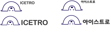
SIGNATURE
- The signature was created by combining our brand mark and logo type in an optimal ratio. Depending on the characteristics of the applied media, an appropriate signature type is chosen from either a left and right combination or from an up and down combination.
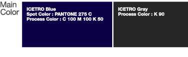
COLOR SYSTEM
- The blue color of ICETRO signifies coolness, functionality, modernity, and convenience. It also symbolizes ice and expresses our technology, which is based on modernity.